We’re not living in the 90’s anymore. Pictures used to be small and grainy, menus used to be stacks of blue underlined words, and websites used to be down right ugly.
But it’s easy now to have graphics flying around, videos and music playing, completely interactive websites are the “latest and greatest”. And they LOOK amazing!
But I don’t think they’re any better than the old-fashioned ones either.
I have a couple of reasons. Unless you’re a digital animator or web designer trying to show off for new clients, the fancy stuff is distracting and taxing on the load times of your website. Instant messaging, 6 second Vine videos, 140 character tweets, PVR so we can fast-forward through commercials, our society has turned into an impatient mess. Nonetheless, we have to act accordingly.
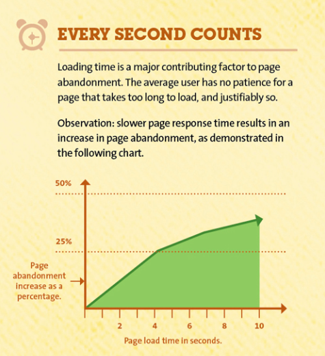
A recent statistic i read by KISSmetrics says that if your page takes 4 seconds to load 25% of your viewers will abandon it, and it only increases from there. 4 seconds! that’s hardly anything, but to lose 25% of your potential business from online viewers because of it? Not worth it.
Let alone the percentage that doesn’t make it to your website, why piss off your viewers before they’ve even seen what you have to offer? A free and quick to use tool for checking the load time of your site is something like Pingdom. It can give you a rough idea and can show you what sections are taking the longest to load.
The more important reason your website should be simple to use:
Websites are not set it and forget it anymore. You need to be able to adapt, make changes, and more importantly do it quickly and properly. If you have money and your website designer is always ready to drop what he’s doing and quickly make your changes then I guess you don’t have to listen to me here. But, I think most of you are doing, or planning on doing it yourself.
You should be able to change pictures, menu items, page content, headers, and most of anything within a few minutes if necessary. For some of you that might seem a little daunting, but I assure you, if you setup your website using WordPress or a similar system most of that is incredibly easy once you spend a few minutes to learn how the first time.
The reason you should be able to change so fast is because it’s cheaper and saves you time. Plus if you have a system that’s easy to use and manipulate, the people you hire later on when your business grows are ready to do similar editing themselves with no problem. The other reason is to be able to keep up with the increasing speed of business growth and changes. Especially in online marketing. New tools and networks are coming out every day, and a system that can easily adapt and connect with the web is important for your sanity and success.
The EVEN MORE important reason your website should be simple to use:
Your customers. Plain and simple they don’t need something complicated. Likely they’re going to your website for only a few things; a resource your provide, a product you sell, or information about you. Make getting those 3 things in front of your customers your top priority over anything. If your site is confusing and they feel they need to go get a PhD before they can come back and get the information they, need you’re doing it wrong. Straight forward menus, accessible information from wherever they are on the website, and a non-distracting design will do wonders for your business.
I don’t mean that you should not put effort into making your website look good. You need to brand it well and have it coincide with the message you are sending. And I’m one of the first people to say appearance matters when it comes to customer perception, but beauty can also be simple and easy to use.
The Summary:
- Keep load times low to retain viewers
- Simplicity is less headache for you in changing content or design
- Think about your customers and what they are really looking to get from your website.
Happy Marketing,
Joel M. Harrison


